

How to Make the Best Videos for (almost) Free
So you want to start making videos.
I’m guessing you are one of the following:
Someone who loves creativity and is looking for the fastest way to tell stories in a new, visual medium.
An employee at a company that is asking (or telling) you to make some simple videos on a very low, or non-existent, budget.
A ministry or non-profit looking to creatively expand your reach on socials.
An aspiring influencer hoping to skyrocket to 1,000,000 followers by tomorrow morning.
Someone looking to leverage AI video tools to create stunning visuals.
Fill in the blank…
Whether you’re brand new to thinking about visual media or you’ve dabbled in a few creative softwares over the years (shoutout to all of my powerpoint warriors out there), there is an easy and effective method to creating appealing videos for your purposes.
Over the next few posts we’ll break this down into a few basic design principals and tech solutions:
Basic composition and design
Easy lighting that works every time
Branding and visual language
Tweak your settings, a few simple camera tricks
Sound (arguably the most important)
Details that matter
In this post we’ll explore the first principal.
Basic Composition and Design
The rule of thirds. This is your best friend when getting started with composition. Basically, you want to break your image into thirds both horizontally and vertically and then place your subject on one of the four intersections (most of the time the top two intersections).
See the image below.
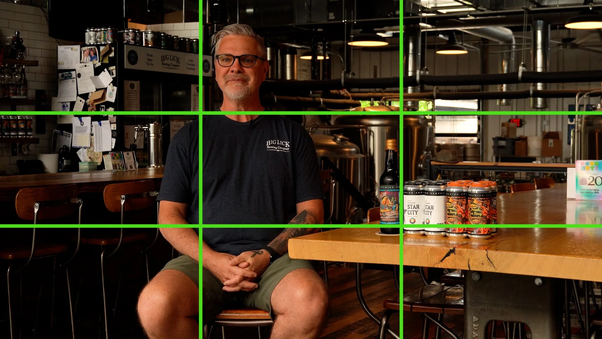
A project we did for Star Tag & Label at Big Lick Brewing Company.
In this example, I placed the subject near the top left intersecting third, but the real subject, the labels on the beer cans, were placed on the opposing lower right third.
There is a lot of technical mumbo jumbo that you can read into (the fibonacci sequence, golden ratio, and so on). The basic principle is that our eyes tend to be drawn naturally to these zones and taking advantage of that tendency will improve your videos tenfold.
This isn’t always the best choice though. Composition is a powerful storytelling tool that will advance your video skills more than almost any other visual cue.
Below we’ll take a look at some other rules of composition:
Center framing
Split framing
Negative space
Lines and movement
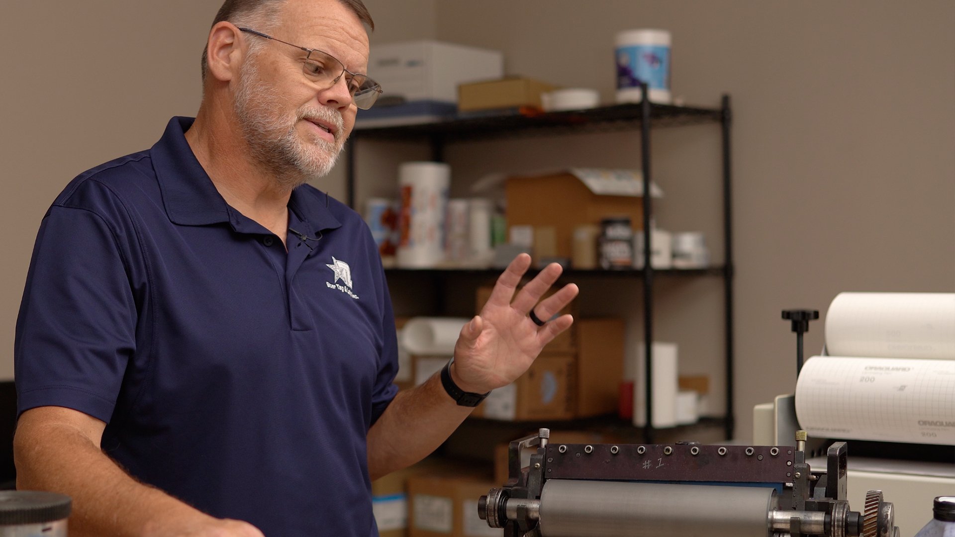
Center Framing
Center framing your subject will create an intentional focus on your subject that could deemphasize the environment. The focuses is always pulled back to the subject.
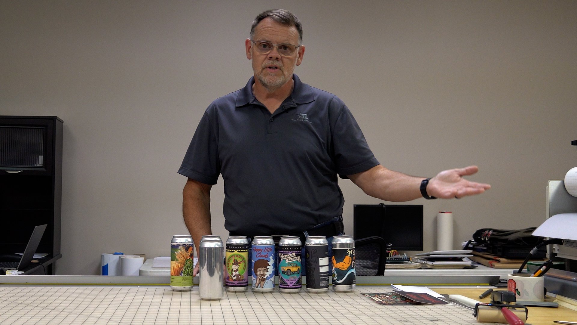
Another project for Star Tag & Label explaining the different methods of printing labels.
This works best for talking head videos that relay a lot of information, but are usually best paired with other shots to break up the monotony. I typically like to have two cameras when available to capture the wider, center frame and a tighter frame that has the subject on the top left third, as seen below. But we don’t always have two cameras. Most of the time we’re working with one, our cell phones.
Split Framing
This method works best to create tension in your frame. You’re basically forcing the viewer to look at your subject or ‘nothing’ on the opposite side of the frame.
You could also use this in a multi subject video to create the aforementioned tension. See the example below.
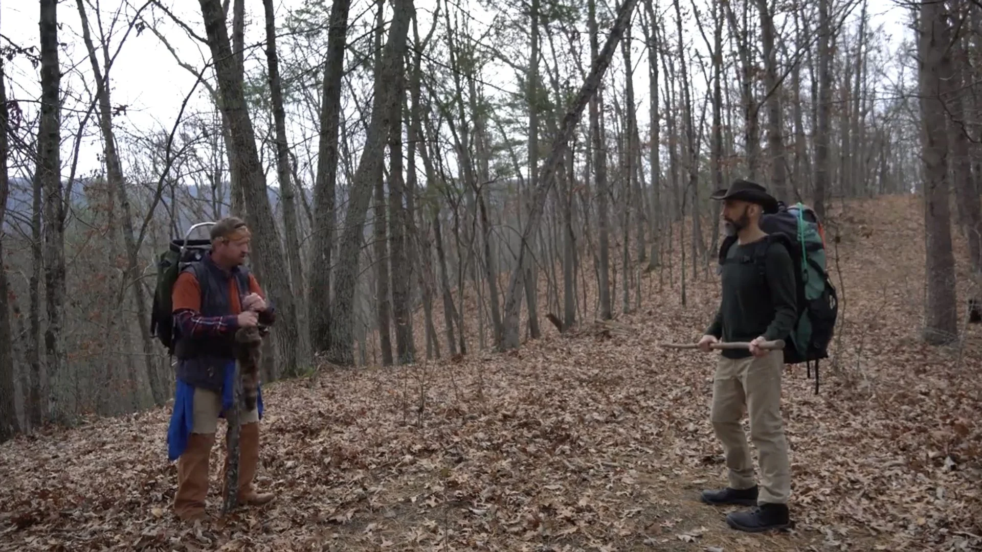
An ungraded, low-resolution, shot from our short film, Fellowman.
In this example you can almost feel the tension of having to choose where to look. In this shot that works to our advantage because the two characters are in a tenuous moment in the story.
Splitting your frame is often more of a hazard for the average video creator than a tool. To achieve balance you have to consider the background elements, site lines and so much more. Unless you want to narratively convey tension, stay away from this composition.
Negative Space
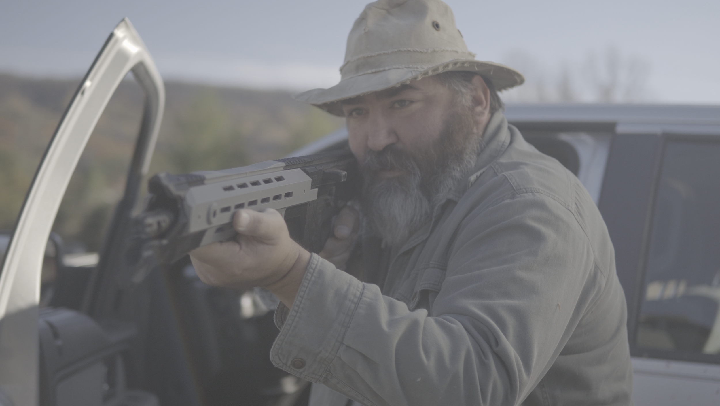
We often think of our subjects and different elements within our frame, but the often overlooked element in our frame is the negative spaces created in the ‘gaps’ around our subjects. Too much negative space and you can create an oppressive and awkward frame. Too little and the subject feels cramped and uncomfortable.
This example shows a balanced use of negative space to create an interesting background without being too cluttered.
This technique is mastered with time and practice. We still have to question each frame and ask ourselves, “what can we add or remove to make this shot more interesting?”
Negative space can be created by adding or removing light patterns, objects, or by placing your subject appropriately in the frame.
Lines and Movement
The same example can be broken down to understand compositional lines and movement.
Lines are directional cues that tell our eyes where to look. Movement is the path that our eyes take throughout the image, and mor importantly, in what order we look at different elements.
In this example we follow these lines with our eyes.
And our eyes are prevented from leaving these unspoken boundaries by framing and eye lines.
These are compositional tools that keep our focus where it needs to rest, or return to rest, after viewing the entire scene.
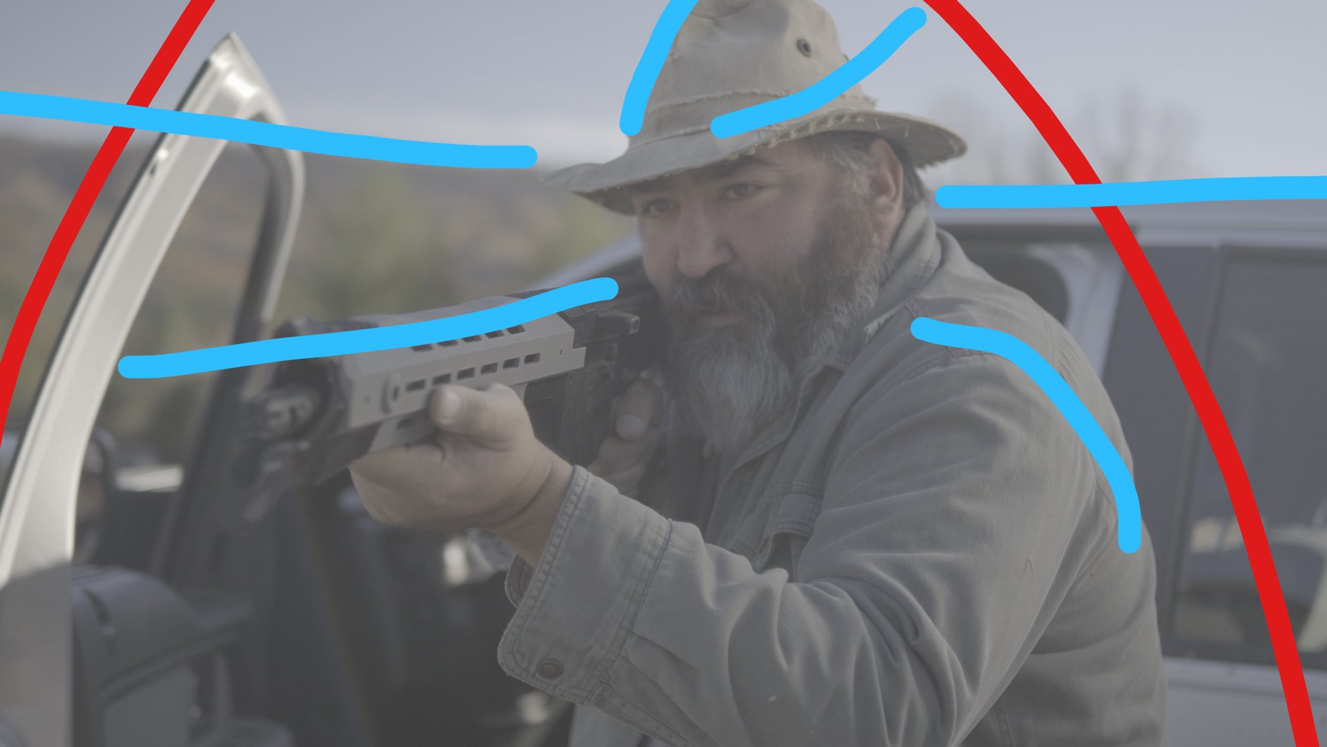
Blue lines direct the eyes, while the red lines prevent the gaze from leaving the frame.
The goal of any frame is to keep the eye moving in a continuous cycle, always leading the eye back to the point of interest. Here the point of interest is the face of the subject and his rifle. The truck and scene in the background are secondary elements, but still important to the overall frame and story.
There are many other theories and principles related to composition but these few should keep you from straying too far in the wrong direction. And most of the time learning and implementing these few will result in stumbling into other important composition rules.
Check back for our next post about basic lighting that works every time!
Looking to expand your knowledge beyond the blog? Book a free consultation with us today to discuss how Booth42 can help you bring your vision to life.